Funny Bus: Comedy City Tour Case Study
"We're pleased with the team’s onboarding, design, and site flow, and it will only get better."
"We're very happy with every aspect of the team from onboarding to design and flow of the site. It will only get better from here."
— Kevin Anderson and Lisa Schnurr, Co-owners and founders, Funny Bus
Funny Bus is a live, BYOB comedy city tour operator running 90-minute bus experiences hosted by local stand-up comedians across Charlotte, Cleveland, and Atlanta. The brand blends sightseeing with a rolling comedy show, and its Charlotte and Cleveland tours are 2025 Tripadvisor Travelers’ Choice winners. That level of third-party validation is rare in the experience-tour category.
Despite a loyal audience, strong ratings, and a steady flow of referrals, the existing website was holding the brand back in search. Three high-volume cities were being funneled through a handful of oversized pages, multiple tour variants were bundled into a single URL, and much of the organic demand around “comedy shows,” “city tours,” and “private tours” was leaking to competitors.
The goal of this engagement was to design an SEO-led website structure and a redesigned user experience that could capture that demand at the city level, support additional tour products without bloating pages, and convert visitors into direct bookings.
Highlights
📈
Reorganized information architecture:
moved from around 6 indexable content pages concentrated at the root to a structured hub-and-spoke model with dedicated city hubs, public and private tour parents, per-tour activity pages, and per-city contact pages.
🚀
Keyword targeting aligned to the new IA: instead of stuffing “comedy shows,” “city tours,” and “private tours” keywords into a single city page, each intent now has a purpose-built URL, eliminating the cannibalization where a single query ranked against up to eight different Funny Bus pages.
🌐
Competitive gap analysis: identified missing surfaces (BYOB explainer, date-night positioning, gift certificates, tour-type variants, FAQs) that competing tour operators and experience marketplaces were capturing, and built them into the new site.
📊
UX rebuild for visibility and dwell time: replaced dated, text-heavy templates with a brand-aligned design centered on clear “choose your city” entry points, transparent tour cards, in-page itineraries, and persistent booking CTAs.
The Need
The old Funny Bus site showed the classic symptoms of an experience brand that had outgrown its original template. Three city pages were asked to rank for every variant of “comedy show,” “bus tour,” “city tour,” and “private tour” simultaneously, which produced heavy keyword cannibalization. The brand term “funny bus” alone ranked across eight different URLs, and non-brand commercial queries kept flipping between the homepage, the Charlotte page, and the Cleveland page depending on the crawl.
Structurally, there was no parent page for public tours or private tours, no per-tour landing pages for variants like the Charlotte PG-13 or Charlotte Drag Queen experiences, no per-city contact pages, and no informational content (blog, BYOB explainer, date-night angle) to capture top-of-funnel search. The flat, depth-0/1 architecture offered nowhere for topical authority to accumulate.
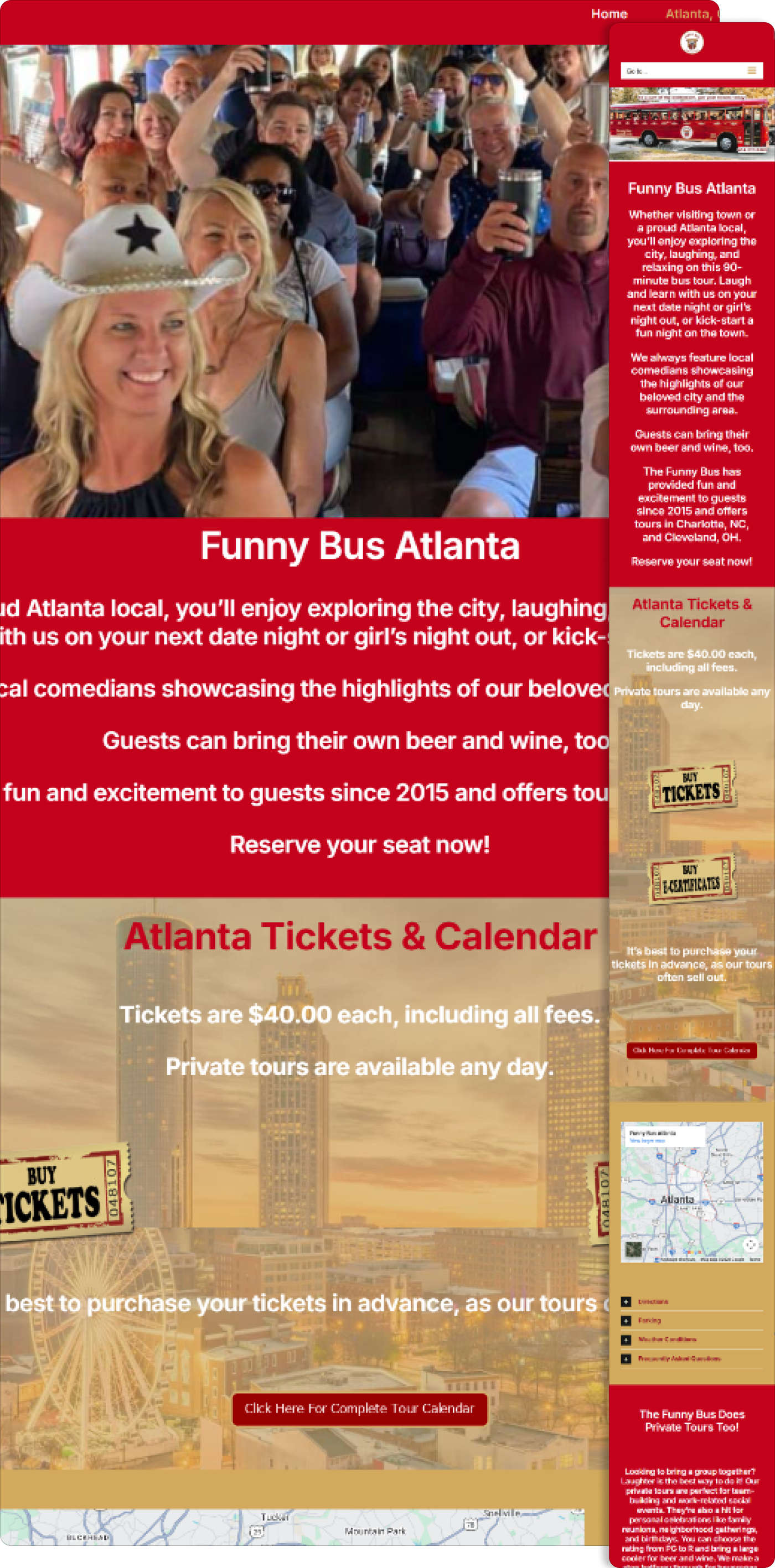
On the design side, the homepage was a stack of color blocks and wall-of-text paragraphs with three raw phone numbers, no pricing, no itinerary, and no booking path. The brand’s voice (playful, confident, “loved by all”) wasn’t reflected in the visual system. Trust signals like the TripAdvisor award were present but buried, and the user had to work to find what tour they could actually take, when, and for how much.
The Opportunity
Funny Bus had earned what most tour operators spend years chasing: consistent five-star reviews, Tripadvisor Travelers’ Choice recognition, and real brand search demand in all three markets. The problem was structural. The website wasn’t built to absorb that demand or convert it.
- The old site ran on just a handful of indexable pages (homepage, three city pages, a franchise page, and a single Cleveland private tour page), forcing every keyword intent through the same URLs.
- City pages were 2,800 to 3,200 words each, covering public tours, private tours, drag-queen tours, PG-13 tours, itineraries, FAQs, and team bios all in one place, which diluted topical focus.
- High-volume non-brand queries like “comedy shows cleveland” (2,400 vol, pos 20), “comedy shows charlotte nc” (1,900, pos 33), and “atlanta city tour” (880, pos 14) sat in striking distance but had no dedicated landing page.
- Charlotte had no private-tour URL at all, and Atlanta’s private-tour intent had nowhere to go.
A rebuilt foundation (cleaner IA, dedicated URLs per intent, and a design that let each page do one job well) would unlock both search visibility and conversion lift without changing the tour itself.
The Plan
To address these issues, we implemented the following strategic plan:
Build a hub-and-spoke information architecture
Rebuild each city (/atlanta, /charlotte, /cleveland) as a true hub that links to dedicated tour activity pages (/activities/charlotte-funny-bus-tour, /activities/charlotte-pg13-funny-bus-tour, /activities/charlotte-drag-queen-funny-bus-tour, /activities/cleveland-funny-bus-tour, /activities/atlanta-funny-bus-tour) and per-city private-tour and contact pages. This gives each intent its own URL, ends cannibalization on “funny bus” and city-level queries, and creates room to add more tours or cities without rewriting the site.
Map keywords to pages before writing copy
Use the old rankings data to identify where Funny Bus was already in striking distance (comedy shows, city tours, sightseeing bus tours, private tours by city) and target each cluster on the right page: city hubs for “[city] comedy bus tours,” activity pages for specific tour variants, and the new /private-tours hub plus /private-tours/[city] pages for group and event demand Atlanta and Charlotte had no home for before.
Close competitive and informational gaps with new surfaces
Add a blog and informational pillar pages (/what-is-a-byob-tour, /comedy-bus-tour-first-date-night, /comedy-tour-vs-regular-city-tour, /why-laughter-helps-you-learn-about-a-new-city), a /faqs page, a /gift-certificate page, and a proper /franchising page with a keyword-led title (“Franchise a Comedy Bus Tour Business”). These surfaces pull in top-of-funnel and consideration traffic the old site ceded entirely to OTAs and experience marketplaces.
Redesign the UX around the decision the user is actually making
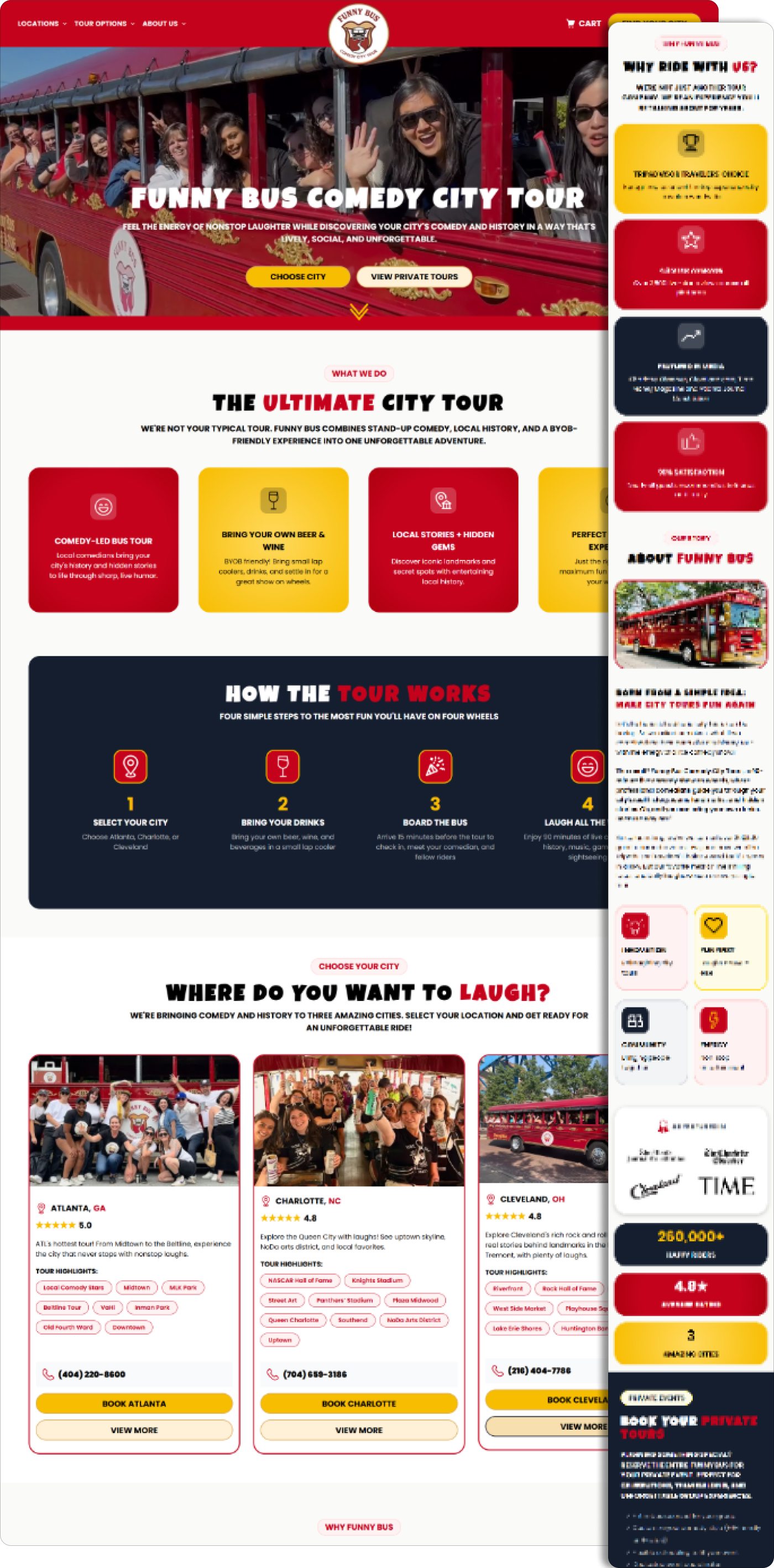
Shift from a color-block text wall to a hero that asks the one question that matters (“Which city?”), and route users into city hubs that present tour options, pricing, itineraries, comedian lineups, parking, FAQs, and booking CTAs in a clear, brand-aligned visual system. Surface the Tripadvisor Travelers’ Choice award above the fold rather than at the bottom.
The Results
The new structure gives Funny Bus a scalable search foundation. Each city is now a hub with its own set of tour, private, and contact spokes, which means any new city (or any new tour variant in an existing city) slots into the existing URL pattern without creating duplicate intent. The brand query “funny bus” consolidates onto a single canonical homepage instead of competing against itself across the homepage, city pages, and private-tour pages. Striking-distance non-brand queries (“comedy shows Cleveland,” “comedy shows Charlotte NC,” “Atlanta city tour,” “Atlanta sightseeing bus tours,” “charlotte city tours”) now have purpose-built city hubs and activity pages to rank from, with supporting informational content building topical authority around the core experience.
The redesign turns the site from a brochure into a booking path. The new homepage leads with a clear “choose your city” decision, showcases the Tripadvisor Travelers’ Choice award as social proof rather than a footnote, and presents tour options with pricing, duration, and itinerary context before asking for the click. City and activity pages use the same pattern (hero, tour variants, itinerary, comedian lineup, FAQs, booking CTA), which gives visitors a reason to stay on the page longer and a clear path to convert. The brand’s tone finally matches the experience: playful, confident, and worth the ride.
Together, the information architecture, keyword foundation, and redesigned UX compound into a growth engine rather than three disconnected improvements. The IA gives search engines clearer signals about what Funny Bus covers in each city, the keyword mapping points every cluster at the right page, and the UX turns that incoming traffic into bookings it used to lose on a dated homepage. As Funny Bus adds tour types and expands into new markets, the same template scales with it. Each new city, variant, and informational piece strengthens the whole system instead of cannibalizing it.
Homepage - Old Design
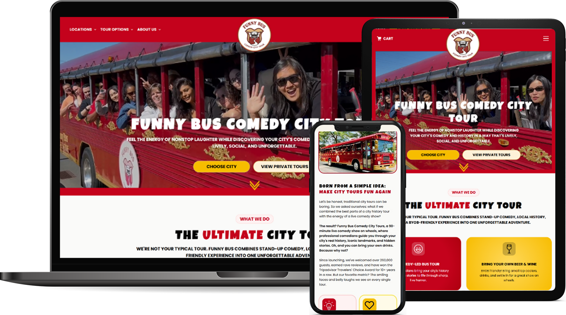
Homepage - New Design
Travel & Tourism Marketing Blog