Geronimo Adventure Park | Case Study
"I want to shout it from the rooftops that Geronimo Adventure Park is the most incredible place for EVERYONE to be welcomed, treated like family and have the most amazing adventure!"
Geronimo Adventure Park is a 13-acre outdoor adventure park in Spring, Texas, just north of Houston. Locally owned and operating since 2020, the park brings together three zipline courses, eight axe-throwing lanes, four rock wall climbing trails and a fully fenced, private property. It is a combination no other operator in the Houston metro offers on a single site. The business has built a genuine local following on the strength of the experience itself, earning an average 4.9-star rating across more than 1,800 Google reviews and the top position in Google's local map results for the searches that matter most to it.
That reputation, however, was doing the work almost entirely on its own. The website carried internal product names that visitors had no way to decode, packed six different zipline products onto a single page, and offered one generic inquiry form to every group audience from corporate teams to scout troops. Nearly 150 of its URLs were image attachment pages and empty taxonomy archives. Competing operators with weaker reviews and smaller parks were outranking Geronimo in organic search simply because their sites were easier to understand. The goal of this engagement was to rebuild the site around an SEO-driven information architecture that matches how people actually search for adventure experiences, and to give the park's group, event and venue business the digital footprint it had never had.
Highlights
- Reorganized information architecture: moved from roughly 190 URLs, nearly 150 of which were `/project/` image attachment pages, empty `/project_category/` archives and orphaned `/review-1/` through `/review-9/` stubs, to 45 purposeful pages organised into five clear branches (Adventures, Groups & Events, Venues, Plan Your Visit and About).
- Keyword targeting aligned to the new IA: instead of a single `/tours/` page carrying the Ultimate Pass, All-Access Pass, three-, two- and one-course options and night ziplining behind a dropdown menu, each product now has its own URL, named the way people search for it rather than in the park's internal language of "Ground Dweller", "Go Fly" and "Go Throw".
- Competitive gap analysis: benchmarking against Go Ape Sugar Land, Texas TreeVentures, Zip Lake Travis and Go Zip Texas showed Geronimo with the lowest domain authority in the set and roughly one-eleventh the referring domains of its closest peers, while also showing where the field was wide open, since no Houston adventure park owned the group, corporate or private-venue searches at all.
- UX rebuild for visibility and dwell time:
replaced a template that asked visitors to scroll or call for a price, an age minimum or a weight limit with activity pages that open on those facts in a single row, alongside the 4.9-star review count the business had never previously displayed.
The Opportunity
Geronimo had already won the hardest part. The park holds the number one position in Google's local map results for zipline houston and adventure park houston, backed by a review profile stronger than any competitor in the metro. What it had not built was a website capable of converting that visibility into organic reach beyond the map pack.
- Six zipline products competing for one URL, with night ziplining, a distinct and separately searched experience, having no page of its own.
- Activities named for internal systems rather than search language, leaving axe throwing, rock climbing and general admission effectively invisible.
- One team-building page serving corporate groups, school trips, scouts, clubs and non-profits alike.
- Three genuine event venues (The Barn, The Park and The Range) with no representation on the site whatsoever.
- Roughly 150 near-empty URLs diluting crawl attention across the domain.
Rebuilt properly, the same reputation that wins the map pack could support a page for every product, audience and venue the business actually sells.
The Need
The limitations of the old site were structural rather than cosmetic. Its navigation offered five primary items beneath a stack of two utility bars, so eight secondary links competed with the pages that drove revenue. Category labels drawn from the park's internal branding gave visitors no way to connect what they wanted with what the site offered. Product pages bundled unrelated purchases together, forcing a single page to rank for intents that deserved separate treatment, while the group and event business, the highest-value bookings the park takes, was compressed into one page ending in a generic inquiry form with no pricing, capacity or audience-specific proof.
The experience compounded the problem. Heroes depended on scripts that delayed the first meaningful content, headings varied in size and case from page to page, and the essential booking facts sat far below the fold. Most tellingly, a business with more than 1,800 five-star reviews displayed none of them where a visitor would decide.
The Plan
- Rebuild the information architecture around products, not systems. We mapped every old URL to a new destination and gave each purchasable experience its own page: zipline courses, night zipping, axe throwing, general admission and the adventure passes. Six products that once shared a single URL now have individual pages, titles and headings, which means each can rank for its own intent and each can be linked to, measured and improved independently.
- Translate the park's language into search language. Internal names carried real brand affection but blocked discovery, so we renamed pages to match how people search while keeping the park's voice in the copy itself. "Ground Dweller" became Axe Throwing; the activity taxonomy became a clear Adventures branch. The result is a site that reads naturally to a first-time visitor and legibly to a search engine.
- Build out the group, event and venue business. We replaced one team-building page with a structure that addresses each audience directly, with pages for corporate, high school trips, scouts, religious and non-profit, and teams and clubs, alongside dedicated event pages and an entirely new Venues branch for The Barn, The Park and The Range. These are the park's highest-value bookings and, until now, its least visible assets.
- Put trust and decision-making information first.
Every page now opens with the facts that determine whether someone books: rating and review count, duration, price range, age minimum, weight limits and group capacity. A consolidated Plan Your Visit branch gathers hours, directions, what to expect, what to wear, pricing, FAQs and the waiver, answering the questions that previously arrived by phone.
The Results
The new structure gives Geronimo something the old site could not: a page for every thing it sells. Each zipline course, each group audience and each venue now has a dedicated URL capable of ranking on its own merits, which turns a five-item menu into a genuine topical footprint across ziplining, axe throwing, climbing, group adventures, private events and venue hire. Removing roughly 150 attachment and taxonomy pages concentrates crawl attention on the pages that matter, and the branch structure means new products, seasonal events or additional audiences can be added without redesigning anything. The architecture is built to grow.
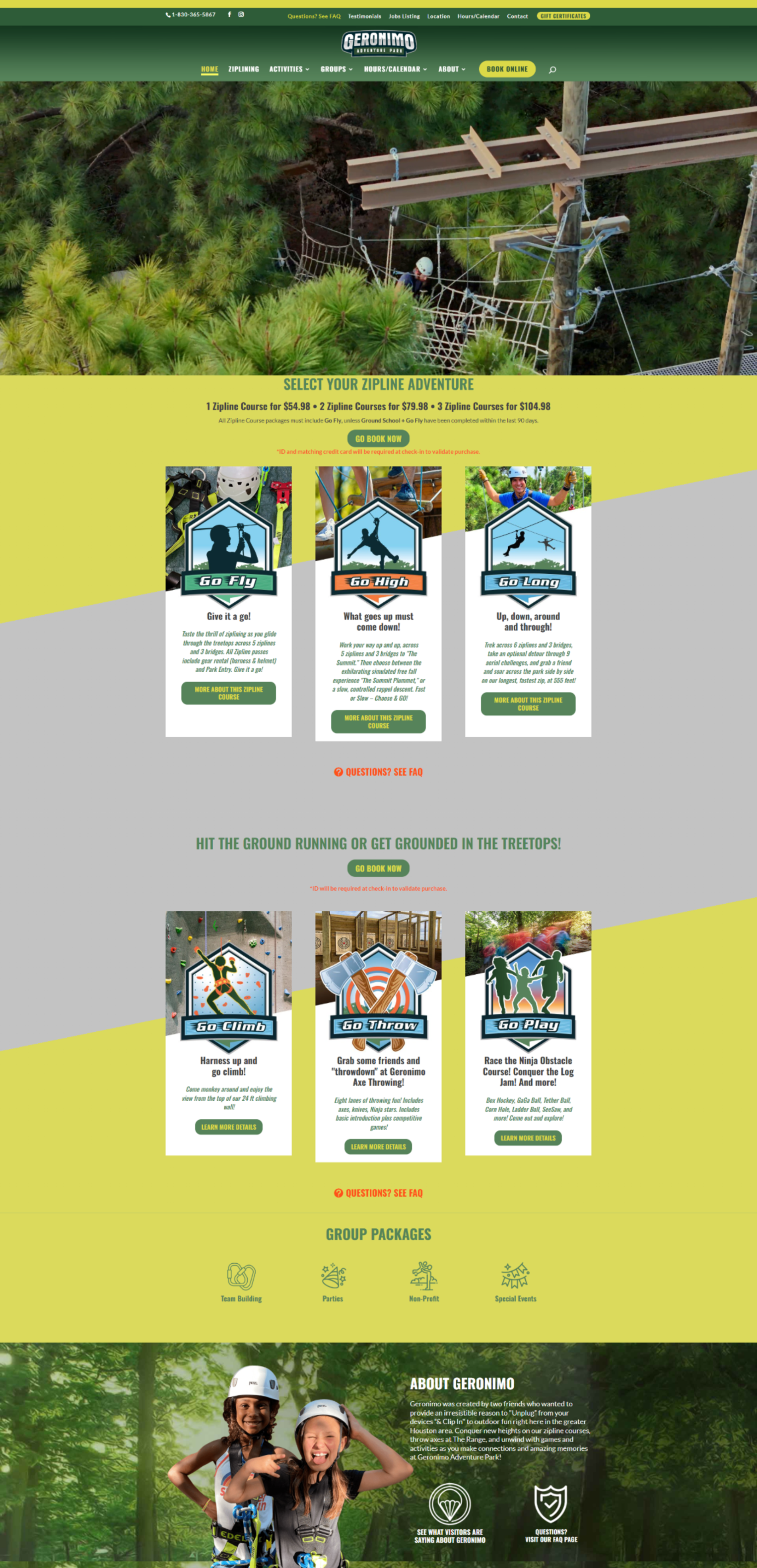
Homepage - Old Design
Homepage - New Design
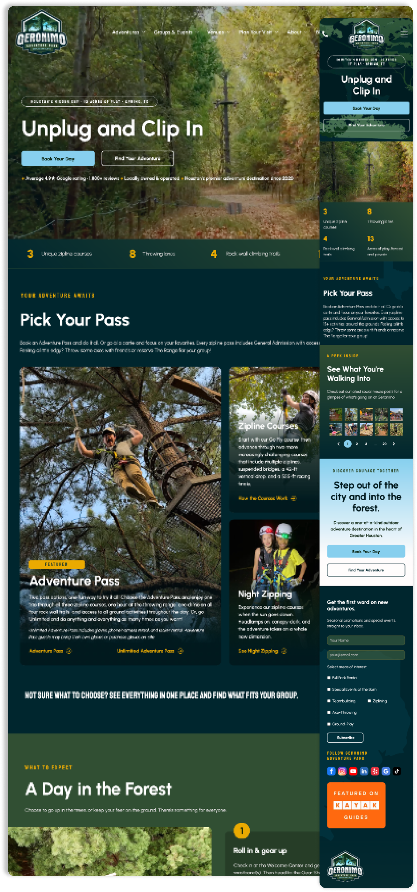
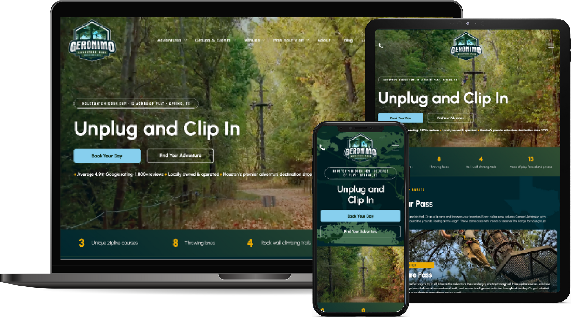
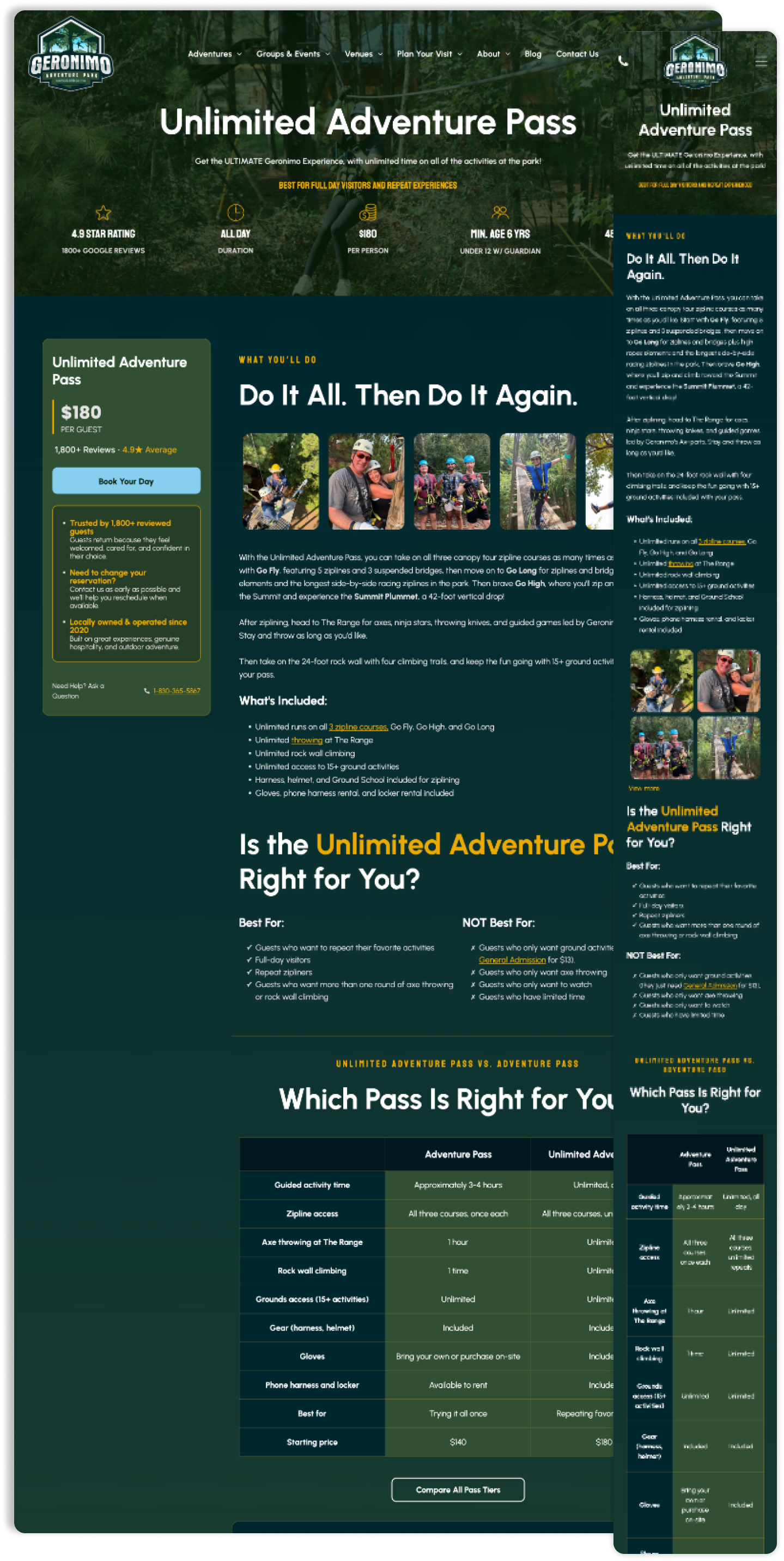
The design work carries the same intent through to the visitor. The park's strongest asset, a 4.9-star rating from more than 1,800 reviews, now appears above the fold on every page rather than being left for a visitor to discover elsewhere. Prices, durations, age minimums and weight limits sit in the first screen of every activity page, so the questions that used to end a visit, or arrive as a phone call, are answered before they are asked. Group and venue pages state capacity and set expectations in plain language, giving corporate planners and party organisers the confidence to enquire. Photography of the actual park replaces stock-feeling headers, aligning what visitors see online with the 13 acres they will walk through.
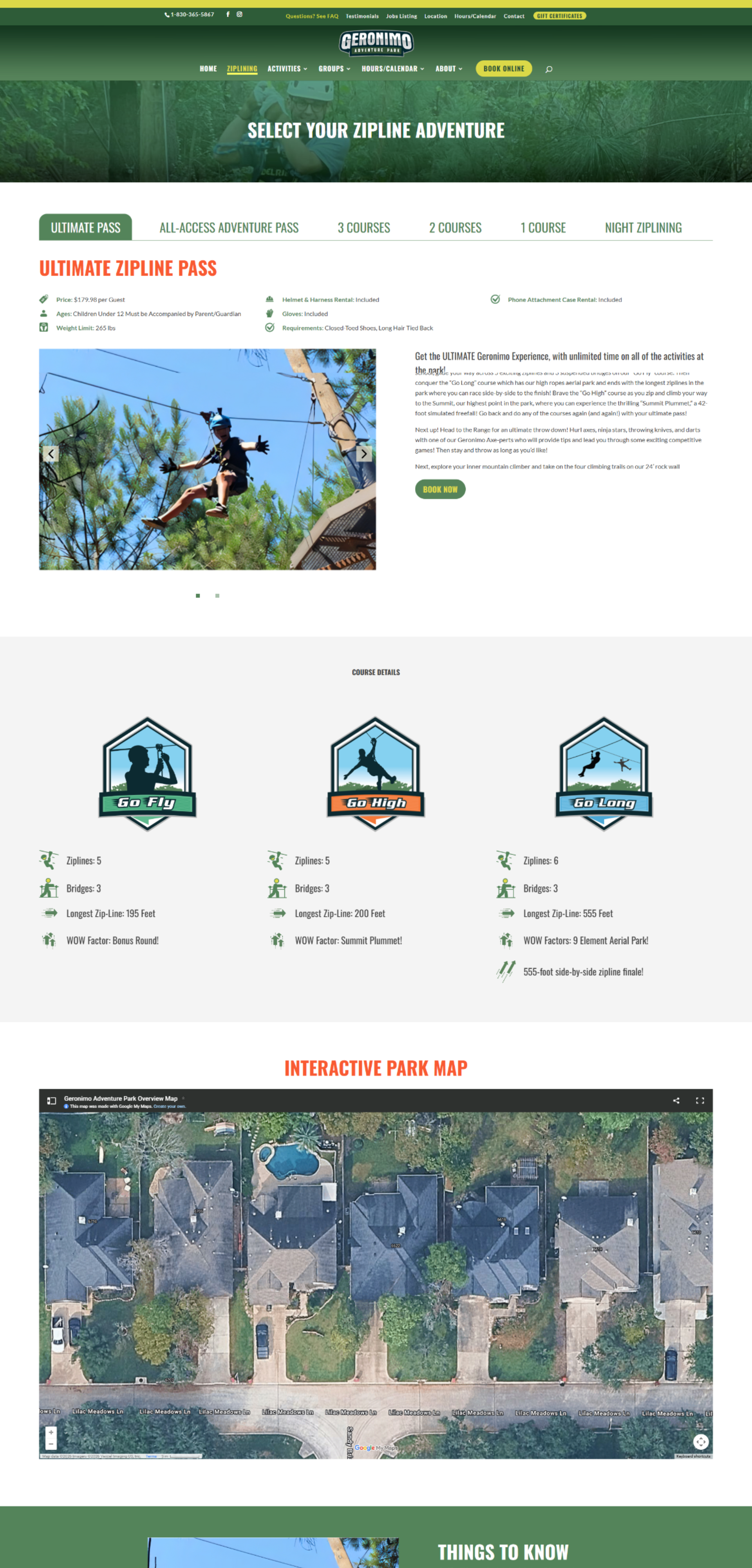
Product Page - Old Design
Product Page - New Design
Together, structure, design and keyword foundation compound. A clear architecture gives search engines a reason to rank individual pages; clear pages give visitors a reason to stay on them; and a growing base of pages that both understand creates room for content such as the planning guides and seasonal articles already published under the blog to draw in visitors earlier in their decision. Geronimo begins this next phase already holding the top local position in its category. The website is now built to convert that standing into direct, durable organic reach across every part of the business, not just the ziplines it is best known for.
Travel & Tourism Marketing Blog